This page provides detailed instrcutions on making maps using Power BI and Python using data coming from the GO - API.
¶ Using GO Basemaps in Power BI
In this section we will using Mapbox tool in Power BI to show the number of deployments in African countries after 1st January 2020 using a Cloropleth map.
For getting the data, we will be using the GO API and retrieving data from the Personnel API endpoint.
The URL for accessing the data in Power BI looks like this:
https://goadmin.ifrc.org/api/v2/personnel/?start_date__gte=2020-01-01T00%3A00%3A00Z
- Here
https://goadmin.ifrc.org/api/tells Power BI to connect with the GO server. All of your API calls to GO will start with this base URL. - The
v2/personnel/refers to the latest version of the API. There are multiple data tables within the database and personnel tells GO to search for the table that stores personnel data (surge deployments). - The
?start_date__gte=start_date__gte=2020-01-01T00%3A00%3A00Zwill retrieve the personnel data starting from 1st January 2020.
Since data is coming from a paginated API, we will be utilizing the method used on the Pagination page along with authorization token to search and retreive data from all API pages.
To utilise IFRC Mapbox styles and tileset in Power BI follow the following steps to build your visualization accordingly.
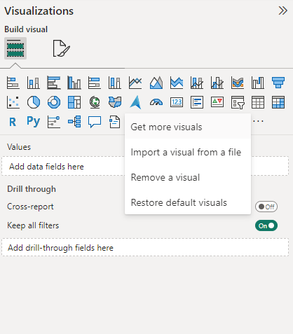
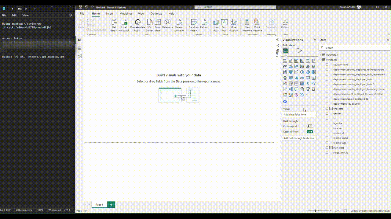
¶ Step 1: Importing Mapbox visual from Marketplace in Power BI
- In Power BI, open a new page
- In the Visualizations, pane, click on the option Get more visuals represented by three dots.
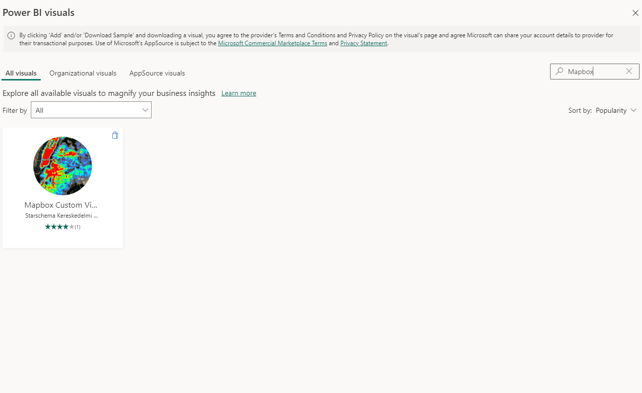
- After that a new window will open titled Power BI visuals. Now type Mapbox in the search box and this will show the Mapbox Custom Visual.
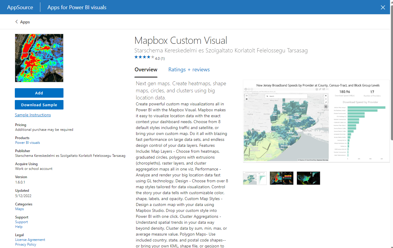
- Click on the Mapbox Custom Visual and a new window will apeear showing its details.
- Now click on the Add option on the left side of the window. Clicking on Add will add the Mapbox visual in the Visualizations pane of your Power BI file.
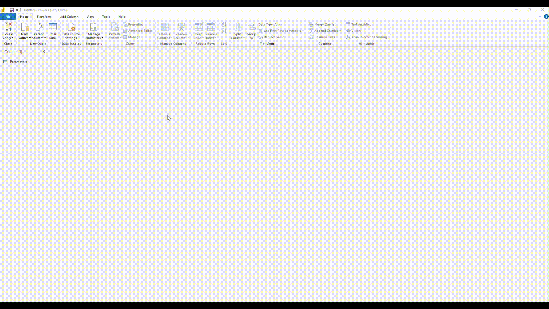
¶ Step 2: Using Power Query in Power BI to retrieve data
-
Click on Transform data option under the Home ribbon to open the Power Query editor.
-
Click on New Source under the Home ribbon in the Power Query editor. Under the New Source option click on Blank Query option. This will create a new Query.
-
Right click on the query name to rename it. Here we will rename it as Personnel data.
-
After this click on Enter Data option under the Home ribbon to insert the authentication token and start date as follows:
.gif)
-
Now click on the Advance editor under the Home ribbon and insert the follwoing m code in the dialog box.
let
    // Get the parameter values
    ParametersTable = Parameters,
    Token = Table.SelectRows(ParametersTable, each [Column1] = "token"){0}[Column2],

    country_from = Table.SelectRows(ParametersTable, each [Column1] = "country_from"){0}[Column2],
    start_date__gte = Table.SelectRows(ParametersTable,each[Column1] = "start_date__gte"){0}[Column2],

    BaseUrl = "https://goadmin.ifrc.org/api/v2/personnel/",
    PageSize = 50,  // Number of items per page

    // Construct the query based on parameter values
    countryFilter =

        if country_from <> null then
            "?country_from=" & Text.From(country_from)
        else
            "" ,
    dateFilter =

        if start_date__gte <> null then

            if Text.Length(countryFilter) > 0 then

                "&start_date__gte=" & Text.From(start_date__gte)

            else

                "?start_date__gte=" & Text.From(start_date__gte)

        else
            "",

    GetPage = (page) =>
        let
            Url = BaseUrl & countryFilter & dateFilter &
            (if Text.Length(countryFilter) > 0 or Text.Length(dateFilter) > 0 then "&" else "?") &
            "limit=" & Text.From(PageSize) & "&offset=" & Text.From(page * PageSize),
            Headers = if Token <> null then [#"Accept-Language"="en", #"Authorization"="Bearer " & Token] else [#"Accept-Language"="en"],
            Response = Json.Document(Web.Contents(Url, [Headers=Headers])),
            Results = Response[results]
        in
            Results,

    CombineAllPages = List.Generate(
        () => [Page = 0],
        each List.Count(GetPage([Page])) > 0,
        each [Page = [Page] + 1],
        each GetPage([Page])
    ),
    #"Converted to Table" = Table.FromList(CombineAllPages, Splitter.SplitByNothing(), null, null, ExtraValues.Error),
    #"Expanded Column1" = Table.ExpandListColumn(#"Converted to Table", "Column1")

in
    #"Expanded Column1"
-
After inserting the code into the Advance Editor click on Done.
-
Next expand the Column 1 by clicking on the icon on the right side of the column name. We will be selecting the follwoing columns in this example:
- start_date
- end_date
- country_from
- deployment
- molnix_id
- molnix_tags
- is_active
- id
- surge_alert_id
- gender
- location
- molnix_status
-
After selecting the columns click on ok and also ensure that the option Use original column name as prefix is unchecked. click done
-
After we have selected the necessary columns, we can transform the data. We expand the deployments column to get data of
country_deployed_to,regionandevent_deployed_to. -
After that from the
event_deployed_to columnwe select thenum_affectedpeople. From thecountry_deployed_tocolumn we select the following data:iso,iso3,independent,is_depreciated,society_nameandname.
we also change the data type of start_date and end_date to datetime. Also we filter out the data for Africa only by selecting 0 (region ID for Africa) from the regions column.
- After this click on Done and the data will be loaded in the query. Then click Close & Apply and the data will be loaded in Power BI.
.gif)
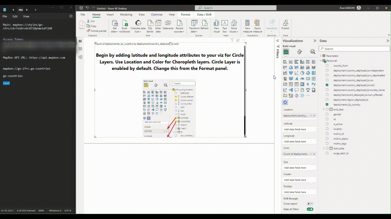
¶ Step 3 Adding access token
- Click on the Mapbox Token to add a new visual.
- In the Data tab of the Vizualization Pane, drag
deployment.country_deployed_to.iso3to the Location field. Also drag thedeployments_by_countriesto the color field. Both Location and color fields are located under the Build visual option which is located under the Visualization pane. The visual will get populated with instructions on how to create your first visualization. - For getting the access token please reach im@ifrc.org
- After you have received your access token paste it in the Access token field under the Viz settings option in the Format visual tab of the Visualization pane.
- Under Map style option select custom.
- Copy the
Style URLand paste it into the Style URL field. The style URL ismapbox://styles/go-ifrc/ckrfe16ru4c8718phmckdfjh0 - In the Mapbox API URL paste
https://api.mapbox.com
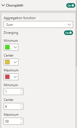
¶ Step 4 Turn on the cloropleth option and configure cloropleth settings
In the Format visual option click on Visual option. Under the cloropleth layer settings do the following steps
- Scroll down and find Data Level 1, click on the Data Level 1 dropdown and select Custom Tileset option.
- Under the Aggregation function select sum.
- Also switch on the Diverging option.
- In the Vector Tile URL Leve 1, paste the map ID of the tileset. The map id of the tileset in our case is
mapbox://go-ifrc.go-countries. - In the Source Layer Name Level 1 field, paste the layer's name. In our case it is
go-countries. - In the Vector Property Level 1 field, enter the unique identifier property name, in our case it is
iso3.
¶ Step 5: Generate the choropleth map
- Click on the Build visual again. Make sure that Location and color fields have the right column names in them.
- Now you can zoom in to see the cloropleth map of the number of deployments done in various African countries.
¶ Step 6: Cutomizing the map and inserting a horizontal bar chart
In order to customize the cloropleth map, we can follow the following steps:
- Under the Aggregation function ensure that sum option is selected.
- Disable Autozoom option. Set the Zoom level to 2.5, lattitude to -1 and longitude to 18

-
Diverging option should be switched on
For the minimum, Center and Maximum options select the following colors respectively:- #41E510
- #E1C233
- #D64550
-
Also, the following values should be set for minimum, Center and Maximum options respectively:
- 1
- 6
- 58
- To prepare a horizontal bar chart click on stacked bar chart option under the Build visual option in the Visualization pane.
- In the Y-axis option, drag
deployments_by_countriescolumn from the data. - In the X-axis option, drag the
deployment_by_countriescolumn and from the dropdown select the Count option.
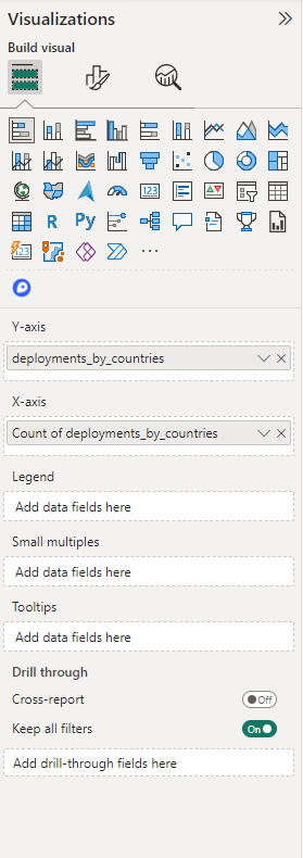
- Under the format visual option, ensure that the Data labels option is switched on.
- You can also customise the X and Y axis as per your decision.
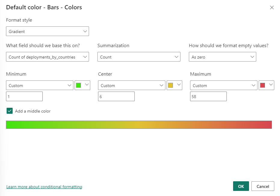
- Under the Bar option, click on conditional formatting and do the following procedure:
- select Gradient from the dropdown under the Format style option.
- in the What field should we base this on? select
deployment_by_countriesoption. - In the Summarization option select Count from the dropdown list.
- Ensure that the colors and values shown before are selected and entered under the Minimum, Center and Maximum options.
- Click the checkbox next to the option Add a middle color.
- When all the above steps have been completed, click on OK. This will change the colors of the bars according to the colors in the map.
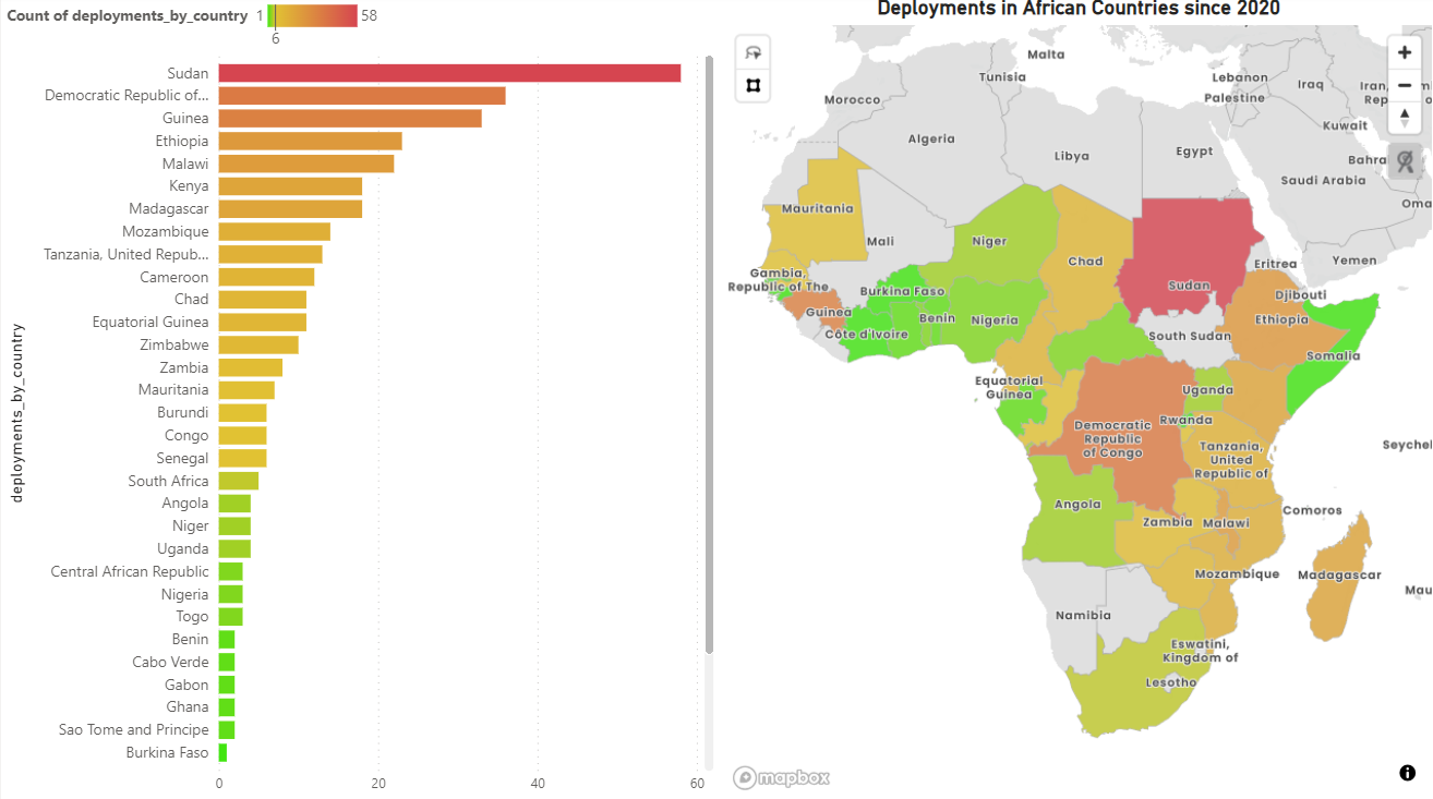
Upon completing all the steps, user can adjust the size of the figure as well as customize the axis and chart labels/ titles and sizes.
The following image shows how the map as well as the horizontal bar chart will appear in Power BI.
¶ Using Python with Mapbox
Mapbox can also be used with python to plot maps. In this example we will be making a choropleth map which is a map composed of colored polygons. It is used to show spatial variation of a quantity. In this example we will be using the px.choropleth_mapbox function from the Plotly express python library to plot the map. In order to learn more about using Plotly express for making maps using mapbox, users can follow the details here.
Making choropleth Mapbox maps requires two main types of input:
- GeoJSON-formatted geometry information where each feature has either an id field or some identifying value in properties.
- A list of values indexed by feature identifier.
The GeoJSON data is passed to the geojson argument, and the data is passed into the color argument of px.choropleth_mapbox, in the same order as the IDs are passed into the location argument. The GeoJSon data can be downloaded from here.
¶ Step 1: Importing necessary libraries
import requests
import pandas as pd

import plotly.express as px
import plotly.graph_objects as go
from plotly.subplots import make_subplots
mapbox_token = "your mapbox token"
In the code above we import the necessary libraries to be used in plotting the map. These include :
- Requests: To query the data from the API.
- Pandas: To handle data as dataframe and apply any transformations.
- Plotly Express is a high-level wrapper around Plotly that offers a simple and concise syntax for creating interactive plots. By importing it as px, you can access its functionalities using the shorthand px.
- Plotly Graph Objects is a lower-level interface to Plotly that provides more control over the appearance and behavior of plots. It allows you to create complex, custom plots by specifying each component explicitly
¶ Step 2: Fetching data from Personnel API endpoint
def fetchEvents(start_date_gte):
    base_url = "https://goadmin.ifrc.org/api/v2/personnel/"
    offset = 0
    page_size = 50
    all_results = []
    auth_token = "your GO API token "

    while True:
        params = {
            "start_date__gte": start_date_gte,
            "offset": offset,
            "limit": page_size,
        }

        headers = {
            "Authorization": f"Bearer {auth_token}"
            # Add other headers if needed
        }

        response = requests.get(base_url, params=params, headers=headers)
        data = response.json()
        personnel = data.get("results", [])

        if not personnel:
            # No more results, break the loop
            break

        # Add fetched events to the results list
        all_results.extend(personnel)

        # Increment offset for the next page
        offset += page_size

    return all_results
We define a function called fetchEvents to fetch the data from the Personnel API endpoint. We use start_date_gte to filter out the personnel data after 2020.
start_date_gte = "2020-01-01T00:00:00"  # Replace with your desired start date
personnel_data = fetchEvents(start_date_gte)
df = pd.DataFrame(personnel_data)
In the code above, the fetchEvents function is called with by specifying start_data_gte parameter. In this example we fetch the data after 2020. Next the data is converted into pandas dataframe.
# List of columns you want to select
selected_columns = [
    "start_date",
    "end_date",
    "country_from",
    "deployment",
    "molnix_id",
    "molnix_tags",
    "is_active",
    "id",
    "surge_alert_id",
    "gender",
    "location",
    "molnix_status",
]

# Creating a new DataFrame with selected columns
selected_df = df[selected_columns]
We specify some of the columns which we need in the data and the column names to be selected are described in the list named selected_columns.
¶ Step 3: Defining some helper functions for data transformation
def extract_nested_value(row, *keys):
    try:
        result = row
        for key in keys:
            if result is None:
                return None
            else:
                result = result[key]
        return result
    except (KeyError, TypeError):
        return None
The above function extract_nested_value is used to extract values from the nested columns/ fields. These fields are nested and contain further information which need to be extracted before using them to plot the map.
columns = [
    "iso",
    "iso3",
    "independent",
    "is_depreciated",
    "society_name",
    "name",
    "region",
]

for column in columns:
    selected_df["country_" + column] = selected_df.apply(
        extract_nested_value, args=("deployment", "country_deployed_to", column), axis=1
    )


selected_df["country_region_code"] = selected_df.apply(
    extract_nested_value, args=("deployment", "region_deployed_to"), axis=1
)


selected_df["num_affected"] = selected_df.apply(
    extract_nested_value,
    args=("deployment", "event_deployed_to", "num_affected"),
    axis=1,
)

selected_df.drop(columns="deployment", inplace=True)
selected_df.drop(columns="country_from", inplace=True)
The above code specifies the fields/ columns which are present inside the nested field named deployment. It further contains three more fields called country_deployed_to, region_deployed_to and event_deployed_to which are also nested fields. The data in country_deployed field such as name and iso3 code have been used for making the choropleth map.
# Replace this path with the actual path to your Africa-specific GeoJSON file
geojson_file_path = "path to geojson file"
with open(geojson_file_path) as f:
    geojson_data = json.load(f)

    # Filter the DataFrame to include only rows where country_region is 0
filtered_df = selected_df[selected_df["country_region"] == 0]
# Count occurrences of each country in the filtered DataFrame
country_counts = filtered_df["country_name"].value_counts().reset_index()

country_counts.columns = ["country_name", "count"]
# Sort the DataFrame in descending order by 'count'
country_counts = country_counts.sort_values(by="count", ascending=False)

filtered_df = filtered_df.merge(country_counts, on="country_name")
In the above code we specify the path of the Africa - specific GeoJSON file and then we open the file and store its contents in the variable geojson_data. We also selected the data for Africa region by specifying the country_region as 0. Later we also count the occurances of each country in order to count the deployments done in each African country and store them in the dataframe called filtered_df.
# Define diverging color scale and range
color_scale = [
    (0, "#41E510"),  # Minimum color
    (0.1, "#E1C233"),  # Center color
    (1, "#D64550"),  # Maximum color
]

range_color = [1, 58]  # Range of values to be mapped to the color scale
The above code is used to specify the color scale that will be used in plotting the map and also for the horizontal bar chart.
¶ Step 4: Plotting data using IFRC tileset
fig_map = px.choropleth_mapbox(
    filtered_df,
    geojson=geojson_data,
    locations="country_iso3",  # Replace with the key in your API response
    featureidkey="properties.iso3",
    color="count",  # Replace with the actual column name in your DataFrame or a color code
    color_continuous_scale=color_scale,
    range_color=range_color,
    mapbox_style=mapbox_style_url,  # Use your Mapbox style URL
    zoom=2.3,  # Adjust the initial zoom level
    center={"lat": -1.5, "lon": 18.5},  # Set the initial center of the map for Africa
    opacity=0.5,  # Set the opacity of the map
)


# Update Mapbox layout with your Mapbox access token
fig_map.update_layout(mapbox=dict(accesstoken=mapbox_token))

# Set figure size
fig_map.update_layout(height=800, width=700)
# Update color bar title
fig_map.update_coloraxes(colorbar_title="<b>Deployments</b>")
# Set bar plot title
fig_map.update_layout(title_text="<b>Deployments in Africa since 2020</b>")


fig_map.show()
This code creates an interactive choropleth map with Mapbox integration, allowing you to visualize and explore data related to deployments in Africa since 2020. The code is explained as follows:
filtered_df: The DataFrame containing the data for the choropleth map.geojson_data: GeoJSON data that defines the boundaries of the geographic regions on the map, in this case it is Africa.locations: Column in filtered_df that corresponds to the geographic regions (countries) in the map. Here the column containingiso3codes of the countries is supplied to the locations variable.featureidkey: Key in the GeoJSON data that matches the locations in the DataFrame.color: Column in filtered_df used to determine the color intensity of each region.color_continuous_scale: The color scale to be used for the choropleth map.range_color: Range of colors for the map.mapbox_style: URL of the Mapbox style to be used.zoom: Initial zoom level of the map.center: Initial center coordinates of the map.opacity: Opacity of the map.
# Create horizontal bar plot figure
fig_bar = px.bar(
    country_counts,
    x="count",
    y="country_name",
    orientation="h",
    color="count",
    color_continuous_scale=color_scale,
    range_color=range_color,
    labels={"count": "Country Count"},
)

fig_bar.update_layout(height=800, width=700)
# Set x and y axis titles with bold text
fig_bar.update_xaxes(title_text="<b>Count</b>")
fig_bar.update_yaxes(title_text="<b>Country Name</b>")
# Set bar plot title
fig_bar.update_layout(title_text="<b>Deployments in Africa since 2020</b>")
fig_bar.update_coloraxes(colorbar_title="<b>Deployments</b>")


fig_bar.show()
The above code is used to make the horizontal bar plot. The figure shows the horizontal bar plot of the countries with the deployments done since 2020. It can be seen that the Sudan has the highest deployments since 2020.